Okay, the fact that we have a new logo might not be “news” as such, but let´s also be honest, YOU clicked the story, so you must have a bit of an interest! Well, read on logo fans 🙂

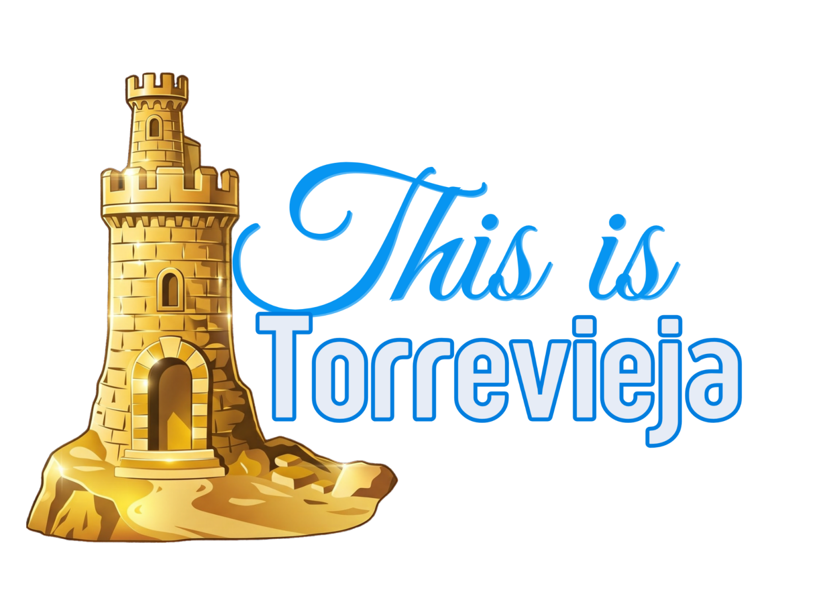
You can see both the new logo below, and the original one we have had for about 20 years now, and we are not saying that old things should be brushed aside, but sometimes we all need a bit of a pamper, so that is what we did. No botox, no fillers, just a bit of smoothing and rounding!
We have of course retained the “old tower” from which Torrevieja gets the name, oroiginally near the Eras de la Sal, and some of the bricks from the long-destroyed icon are used in the church in the main square.
And, talking of square, that is what we have done, slightly! We have gone a little leaner on the sides, and taller on the top, to give us a little bit more of a squared image.
We have also gone for a rounder font in the word Torrevieja, and added a slight sheen, giving it an almost concrete colour, which is more reflective of the Torrevieja of today. Who needs trees, and nature, and gardens, when we can have concrete (yes, that is sarcasm),
Anyway, we hope you like it. YOu have done well to read this far. If we were somebody like Shell, we would probably be telling you it cost millions to develop, but we are not. We are, in fact, This is Torrevieja 🙂
New Logo
Old Logo

Eviction of 95-year-old man in Benidorm postponed for one month
